SUBHEAD: A computer font made out of the shapes of gerrymandered voting districts.
By Rusty Blazenhoff on 2 August 20129 for Boing Boing -
(https://boingboing.net/2019/08/02/gerry-is-an-ugly-font-made-fro.html)
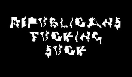
Image above: A message to Republicans on gerrymandering by someone using the UglyGerry type font. Of course Democrats have played their pert in this as well. From (https://pbs.twimg.com/card_img/1157070040816128006/gEPX-685?format=jpg&name=600x314).
Ooh, this is awesome. Activists have made a free font called Gerry that is made from the shapes of gerrymandered congressional districts. They encourage you to use it to write your representative.
The font’s creators, Ben Doessel and James Lee, made it to raise awareness and provide a method for disenfranchised voters to protest partisan gerrymandering. The duo, in a press release provided to the media, stated:
Congressional districts have a reputation for being downright ridiculous.
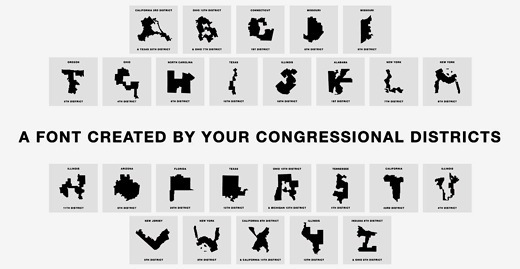
Image above: The alphabet made of gerrymandered US voting districts. From (https://www.uglygerry.com/) (https://twitter.com/UglyGerry). Click to enlarge.
.https://www.uglygerry.com/
By Rusty Blazenhoff on 2 August 20129 for Boing Boing -
(https://boingboing.net/2019/08/02/gerry-is-an-ugly-font-made-fro.html)

Image above: A message to Republicans on gerrymandering by someone using the UglyGerry type font. Of course Democrats have played their pert in this as well. From (https://pbs.twimg.com/card_img/1157070040816128006/gEPX-685?format=jpg&name=600x314).
Ooh, this is awesome. Activists have made a free font called Gerry that is made from the shapes of gerrymandered congressional districts. They encourage you to use it to write your representative.
The font’s creators, Ben Doessel and James Lee, made it to raise awareness and provide a method for disenfranchised voters to protest partisan gerrymandering. The duo, in a press release provided to the media, stated:
"After seeing how janky our Illinois 4th district had become, we became interested in this issue. We noticed our district’s vague, but shaky U-shape, then after seeing other letters on the map, the idea hit us, let’s create a typeface so our districts can become digital graffiti that voters and politicians can’t ignore."For those unfamiliar with gerrymandering, it’s the process by which US voting districts use increasingly nonsensical borders to disenfranchise voters and limit who they can vote for by party lines instead of geography.
Congressional districts have a reputation for being downright ridiculous.
"North Carolina's 12th district resembled a severely broken snake until it was revamped in 2017. Pretty much all of Maryland's districts defy comparison to anything but abstract art. And then there are a few dozen districts that look like letters in the alphabet — so much so that an anonymous gerrymandering fighter turned them into a font.
A few of the letters in the Ugly Gerry typeface are a combination of side-by-side districts, while New York's 8th District is turned on its head to be both the "M" and "W" in the alphabet. But most of the districts don't even require much squinting to resemble letters, which are all downloadable in one file on UglyGerry.com."
From (https://theweek.com/speedreads/856423/someone-made-font-gerrymandered-congressional-districts)

Image above: The alphabet made of gerrymandered US voting districts. From (https://www.uglygerry.com/) (https://twitter.com/UglyGerry). Click to enlarge.
.https://www.uglygerry.com/
