SUBHEAD: The artwork of Robert Crumb meets the podcasts of James Kunstler.
By Juan Wilson on 1 August 2009for Island Breath -
(http://islandbreath.blogspot.com/2009/08/kunstler-digs-crumb.html) '
Besides his cartoons and cover art Crumb has managed to create card decks featuring obscure blues and country music artists inspired by his 78rpm record collection and 3D statuettes of his drawn characters.
He has also done illustrations showing the past and future of America. As an architect and planner these fascinate me. I first saw his animated GIF file on the internet titled "A Short History of America" (see below).

My daughter later gave me a large color poster with the twelve panels of that history. It now sits in the office of a non-profit arts council in a RustBelt city south of Buffalo. That image is still available as a print from http://www.crumbproducts.com/prints.html.
After looking at this poster for a while I realized that the series is likely in ten year increments, starting from 1850 and passing, by decades, to 1960. I am not sure what the date of the original artwork was.
At the bottom-right corner of the 12th panel of "A Short History of America" Robert Crumb finally asks "What's Next?" Unfortunately, we have missed the panels covering 1970, 1980, 1990 and (panels 13, 14 and 15) we may now have in hand panel 16 for the year 2000.
Yesterday I was cruising the web and uncovering stones at Jim Kunstler's web empire at http://www.kunstler.com. There I discovered what I think is the missing 15th panel of the series. That image is the banner that flies at the top of the KunstlerCast website http://www.kunstlercast.com.
Note that this appears to be an illustration of the same intersection. Now the fastfood joint appears to be drive-thru only. In the foreground we see an obese customer riding away on what appears to be an electric wheelchair. In the distance is a Galleria mall and parking structure that is partially obscured by an interstate overpass where train tracks onceoperated.
After studying the artwork decided it could only have been done by Ken Avidor, of Roadkill Bill fame (http://www.roadkillbill.com/Ken.html). I called Jim Kunslter and confirmed Ken as the source and that the image was acquired through Jim's podcast partner Duncan Crary. THank you Ken, Duncan and Jim for filling in this blank panel in the history of America.
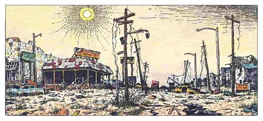
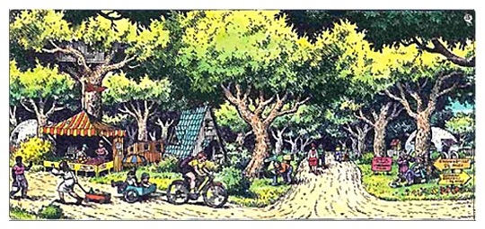
Ken's drawing does appear to be America today. But what of the future? Suddenly I remembered an article we did on Peak Oil in 2006, which was illustrated with Crumb images. There were three panels. Two of them represented what might alternatives for the latest panels of the series.
In that article were three images.
See also:
[IB Editor's Note: This is graphically heavy post. Give it a moment to load]
By Juan Wilson on 1 August 2009for Island Breath -
(http://islandbreath.blogspot.com/2009/08/kunstler-digs-crumb.html) '
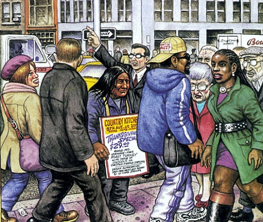
For forty years I've been a fan of Robert Crumb's cartoons. From the first edition of ZAP comics I was a believer. Over the years we have done a few articles on his art. One focussed on a New Yorker Magazine cover from November 29th, 2009 with the subject of Thanksgiving. Crumb illustrated a native American (Manhattan tribe) reduced to holding a sandwich-board sign in the mid-town crunch of pedestrians that advertises turkey specials from the "Country Kitchen"
Image above: Detail of New Yorker cover by R. Crumb. Click to see full cover. From http://www.islandbreath.org/2004Year/13-justice/justice06CrumbSpecial.html
Besides his cartoons and cover art Crumb has managed to create card decks featuring obscure blues and country music artists inspired by his 78rpm record collection and 3D statuettes of his drawn characters.
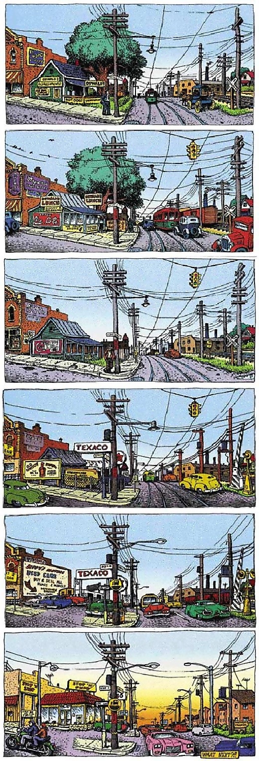
He has also done illustrations showing the past and future of America. As an architect and planner these fascinate me. I first saw his animated GIF file on the internet titled "A Short History of America" (see below).

My daughter later gave me a large color poster with the twelve panels of that history. It now sits in the office of a non-profit arts council in a RustBelt city south of Buffalo. That image is still available as a print from http://www.crumbproducts.com/prints.html.
After looking at this poster for a while I realized that the series is likely in ten year increments, starting from 1850 and passing, by decades, to 1960. I am not sure what the date of the original artwork was.
Image above: "A Short History of America" poster. From http://www.islandbreath.org/2007Year/06-economy/0706-04GrowthMeasure.html
Larger scale images of this series is available from The Guardian at this website, http://arts.guardian.co.uk/crumb/images/0,15830,1430855,00.html
Larger scale images of this series is available from The Guardian at this website, http://arts.guardian.co.uk/crumb/images/0,15830,1430855,00.html
At the bottom-right corner of the 12th panel of "A Short History of America" Robert Crumb finally asks "What's Next?" Unfortunately, we have missed the panels covering 1970, 1980, 1990 and (panels 13, 14 and 15) we may now have in hand panel 16 for the year 2000.
Yesterday I was cruising the web and uncovering stones at Jim Kunstler's web empire at http://www.kunstler.com. There I discovered what I think is the missing 15th panel of the series. That image is the banner that flies at the top of the KunstlerCast website http://www.kunstlercast.com.
Note that this appears to be an illustration of the same intersection. Now the fastfood joint appears to be drive-thru only. In the foreground we see an obese customer riding away on what appears to be an electric wheelchair. In the distance is a Galleria mall and parking structure that is partially obscured by an interstate overpass where train tracks onceoperated.
After studying the artwork decided it could only have been done by Ken Avidor, of Roadkill Bill fame (http://www.roadkillbill.com/Ken.html). I called Jim Kunslter and confirmed Ken as the source and that the image was acquired through Jim's podcast partner Duncan Crary. THank you Ken, Duncan and Jim for filling in this blank panel in the history of America.
Ken's drawing does appear to be America today. But what of the future? Suddenly I remembered an article we did on Peak Oil in 2006, which was illustrated with Crumb images. There were three panels. Two of them represented what might alternatives for the latest panels of the series.
In that article were three images.
1) There is no Peak Oil Crisis (to be discounted)
2) The worst case Peak Oil scenario (2010) panel 17
3) The best outcome of Peak Oil (2020) panel 18

Image above: R. Crumb's worst case future we nominate for panel 16 (2010)

Image above: R. Crumb's best case future we nominate for panel 17 (2020)
Well, at least we can hope.
See also:


12 comments :
Juan,
Thanks for this fun post!
I commissioned Ken Avidor to draw that banner specifically for the KunstlerCast. (Avidor's signature appears on the image next to the man on the Rascal scooter.)
I talked with Kunstler about R. Crumb on KunstlerCast #11: Picturing Suburbia.
--
Duncan Crary
Host/Producer
The KunstlerCast
Hope for the best...
Aloha Island Breath & Duncan, wow, what a find! I printed and handed out R Crumb's panel locally to fight a shopping center conversion of the last large plot of open farm land visible from US 101 in San Luis Obispo, CA. I have always loved this strip and am happy to see it has updates to it. I await the latest Kunstlercast every week and look forward to a reductive lifestyle. We looked for and almost bought a lot in Kauai, but ended up on Big Island. Still working on making our escape to there someday. I am exploring rammed earth and straw-bale construction methods (can't the sugar cane detritus that gets burned regularly be substituted for straw?) and am also trying to figure out how to convert all the plastic trapped in the Pacific gyre into compressed blocks using the natural volcanic heat there. Big tasks, but with the right connections, it could happen. Mahalo for the post. Guy Haratani
here's a model for an urban farm... a possible 'best case' scenario for our current and future vacant city/suburban lots.
http://ehrlum.com/groundup/napamw/
salud, gregg brazel
Those drawings really show transport policy and related land use.
The sad thing about them was the loss of the tracks & trees.
soylent green baby.
posted by A. Crumb
I love Crumb's "History of America." I've seen a version of the poster which has the original sequence of twelve panels along with the three "alternative future" panels (they were commissioned years later as an update to the original work, I think by the Whole Earth Quarterly): the techno-topia, doomer and eco-topia futures.
Mike Cagle
I can only dream that these series of prints could be carried beyond the net, hardcopy, to every remaining newspaper and also the mainstream mags!
Super artwork and a very revealing message that anyone in their right mind must understand.
These panels are indeed quite thought provoking. I spent some time thinking about the nominated panels 16 and 17. The first thing I note is that the implication is that we must move through the doomer-image period in order to move on to something (anything) new. This rings true to me.
The last “Eco-topian vision” panel is offered as a breath of fresh air - inviting - more humane - relaxed. But it looks just a little too much like "vacation." Without the crutch of cheap and abundant energy (oil), I hold little hope for any kind of balanced existence without the world going through the doomer period with horrific devastation and loss of life. And I wonder about what options to build something new will remain – I wonder about the very long lasting legacy of global pollution, habitat and species loss, depleted soils, important minerals and materials that will no longer be reachable, etc. Is an Eco-topic reality going to be possible? Did this future vision drop from possibility in the 60s or 70s or perhaps even further back?
The other thing I perceive in the last panel is that this vision seems suited to the fit and young. Do the concomitant reductions in energy, technology, and medicine portend a dark-side to such an Eco-topic vision for the elderly, the disabled, or the ill? What are the sociological consequences of that?
I do believe we will find some kind of balance in the world, sometime after the collapse unwinds much of the destructive structure we have spent decades building. But we will also live with a persistent, ongoing legacy of the environmental damage we have wreaked. I can’t help but feel that the shape of our future is likely to be quite different from what we might be able to envision from our current vantage point.
- Nightfishes
panel 16 looks like my home town
panel 17 kind of looks like a park in the centre of town
Similar idea has been done in 1975 by a Swiss illustrator:
http://www.cpluv.com/www/item/jamiejap/22758
Post a Comment